Editorial CMS
UX Design | Spring 2016 | Tamedia
Tamedia CMS offers a flexible and efficient environment for structure and strategy changes.
How we get started
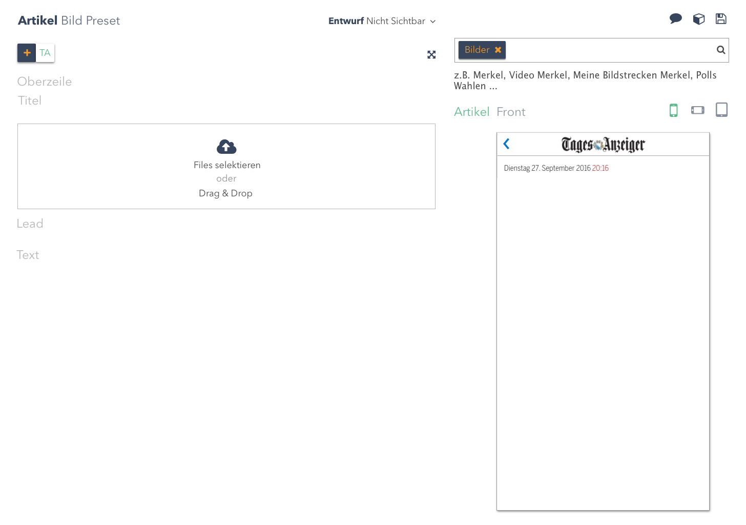
The CMS at Tamedia was almost 15 years old and a number of new features have been attached over the years. Those meet the business requirements, but caused quite some significant usability problems. There were many pre-existing CMS, both commercial and open source, it was difficult to find one, which meets the exact business and user needs of Tamedia’s editorial contents. For that reason we decided to build our own one.
Understand
Ideate
Problems
Solutions
1. Workflow has not been reflected to the tool
1.1 Tamedia shares articles between 7 newspapers but it needs to be customised for every single newspaper for their own character. This process was a big workaround with copy and paste and journalists sometimes even lost the original article.
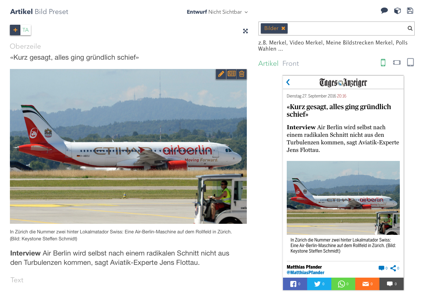
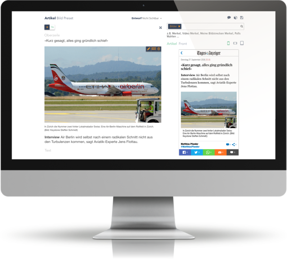
For the flexibility of publishing articles for various newspapers, every article has an instance and can be edited for its own character and be republished.
1.2 Breaking news and live tickers are one of the most important aspects of the business. However, this hasn’t been applied to the design. There were too many redundant steps, those hindering immediate actions.
2. The system doesn’t meet Business Needs anymore
3. Inadequate writing environment
4. No orientation
Prototype
Visual Design
